CSS Grid vs Flexbox: When to Use Each
CSS Grid and Flexbox are powerful layout tools for web design. Here's a quick guide on when to use each:
Use CSS Grid for:
- Complex 2D layouts (rows and columns)
- Magazine-style designs
- Precise content placement
- Responsive layouts without media queries
Use Flexbox for:
- 1D layouts (single row or column)
- Aligning items in a container
- Creating flexible content areas
- Building navigation menus
Quick Comparison:
| Feature | CSS Grid | Flexbox |
|---|---|---|
| Dimension | 2D (rows and columns) | 1D (row or column) |
| Best for | Complex page structures | Component-level layouts |
| Content size | Works with known and unknown sizes | Excels with dynamic content |
| Learning curve | Steeper | Gentler |
| Browser support | 97.94% | 98.51% |
Both tools have strong browser support, so you can use them confidently in most projects. The key is to assess each layout task and choose the tool that fits best. Don't hesitate to combine Grid and Flexbox when needed for optimal results.
Related video from YouTube
What is CSS Grid?
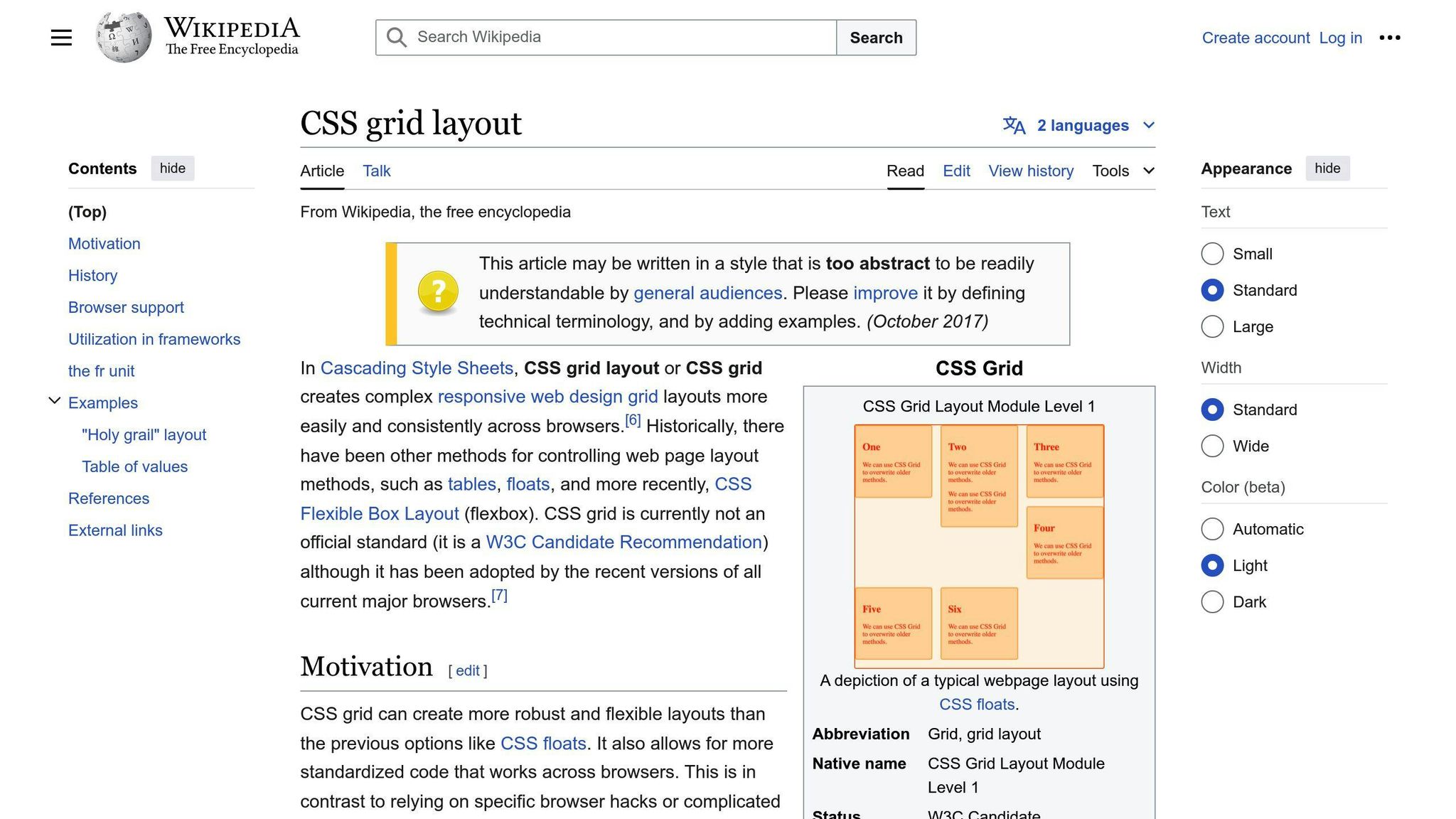
CSS Grid is a two-dimensional layout system that allows web developers to create complex, responsive layouts using rows and columns. It's part of the CSS specification and is supported by most modern browsers.
Basic Concepts
CSS Grid works by defining a container element as a grid, then placing child elements within that grid. Here's a simple example:
.container {
  display: grid;
  grid-template-columns: 1fr 1fr 1fr;
  grid-template-rows: auto auto auto;
}
This code creates a 3x3 grid layout. The fr unit represents a fraction of the available space.
Main Features
CSS Grid offers several key features:
- Grid Lines: Horizontal and vertical lines that define the structure of the grid.
- Grid Tracks: The spaces between grid lines, forming rows and columns.
- Grid Cells: The intersection of a row and column.
- Grid Areas: Named regions of the grid that can span multiple cells.
How to Use CSS Grid
To use CSS Grid:
- Set the container element's
displayproperty togrid. - Define columns and rows using
grid-template-columnsandgrid-template-rows. - Place items in the grid using properties like
grid-columnandgrid-row.
For example:
.item {
  grid-column: 1 / 3;
  grid-row: 2 / 4;
}
This places an item from column line 1 to 3 and row line 2 to 4.
CSS Grid is particularly useful for:
- Creating complex page layouts
- Building responsive designs without media queries
- Implementing magazine-style layouts
- Designing card layouts with different content sizes
What is Flexbox?
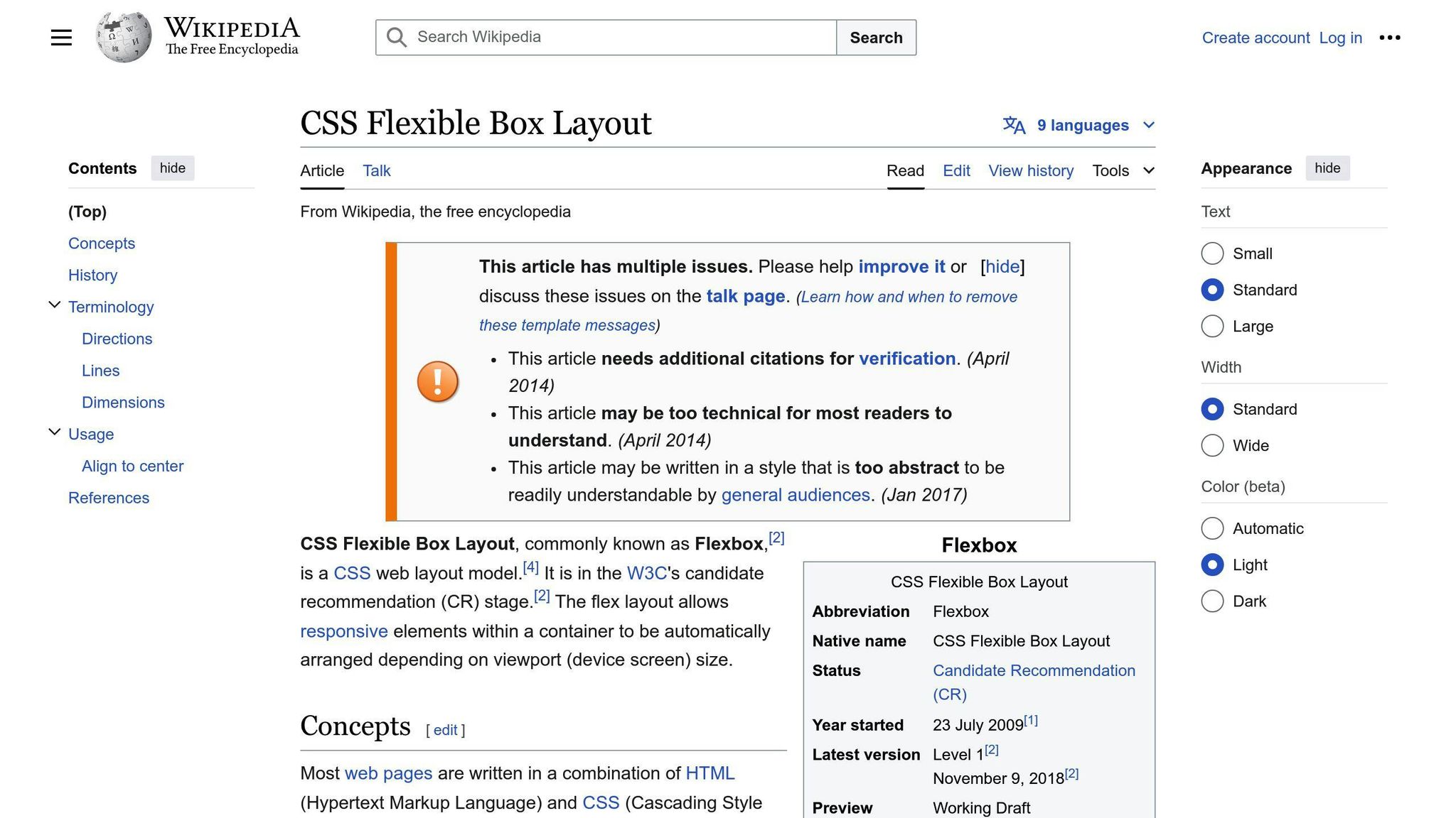
Flexbox is a CSS layout system for arranging items in a single direction. It's a key tool for web developers to create flexible, responsive designs without relying heavily on floats or positioning.
Basic Concepts
Flexbox works on a container-item model:
- Flex Container: The parent element, set with
display: flex - Flex Items: The child elements inside the flex container
Flexbox operates on two axes:
- Main Axis: The primary direction of layout (horizontal by default)
- Cross Axis: Perpendicular to the main axis
Main Features
- Flexible Item Sizing: Items can grow or shrink based on available space
- Alignment Control: Easy vertical and horizontal alignment
- Space Distribution: Efficient distribution of space between items
- Order Manipulation: Change the visual order of items without altering the HTML
How to Use Flexbox
To start using Flexbox:
- Create a flex container:
.container {
  display: flex;
}
- Set the main axis direction:
.container {
  flex-direction: row; /* or column, row-reverse, column-reverse */
}
- Align items along the main axis:
.container {
  justify-content: space-between; /* or flex-start, center, space-around, etc. */
}
- Align items along the cross axis:
.container {
  align-items: center; /* or flex-start, flex-end, stretch, etc. */
}
Flexbox is particularly useful for:
- Creating navigation menus
- Centering content vertically and horizontally
- Building equal-height columns
- Designing responsive layouts
For example, to create a simple navigation menu:
<nav class="flex-container">
  <a href="#">Home</a>
  <a href="#">About</a>
  <a href="#">Services</a>
  <a href="#">Contact</a>
</nav>
.flex-container {
  display: flex;
  justify-content: space-around;
}
This code creates a horizontally spaced navigation menu that adjusts to different screen sizes.
Flexbox's power lies in its ability to create layouts that adapt to various screen sizes and content amounts, making it a go-to choice for responsive web design.
CSS Grid vs Flexbox: Key Differences
CSS Grid and Flexbox are two powerful layout systems in CSS. Let's look at their key differences:
1D vs 2D Layouts
Flexbox is a one-dimensional layout system, while CSS Grid is two-dimensional:
- Flexbox: Works with either rows OR columns
- CSS Grid: Works with both rows AND columns simultaneously
This fundamental difference affects how each system handles layout tasks.
Layout Control
Grid offers more precise content placement, while Flexbox focuses on content flow:
| Feature | CSS Grid | Flexbox |
|---|---|---|
| Content Placement | Precise, grid-based | Flexible, flow-based |
| Item Sizing | Fixed or flexible | Primarily flexible |
| Gaps | Built-in gap property | Requires workarounds |
| Alignment | Both axes simultaneously | One axis at a time |
Browser Support
Both Grid and Flexbox have strong browser support:
- Flexbox: 98.51% of browsers
- CSS Grid: 97.94% of browsers
However, older versions of Internet Explorer (IE11-) and Edge (15-) don't support Grid.
Ease of Learning
Flexbox is generally considered easier to learn due to its simpler, one-dimensional nature. Grid's power comes with a steeper learning curve.
Comparison Table
| Aspect | CSS Grid | Flexbox |
|---|---|---|
| Dimensionality | 2D (rows and columns) | 1D (row or column) |
| Best For | Complex, multi-column layouts | Simple, linear designs |
| Content Size Knowledge | Works well with known and unknown sizes | Excels with dynamic content sizes |
| Browser Support | 97.94% (excluding older IE/Edge) | 98.51% |
| Learning Curve | Steeper | Gentler |
In practice, many developers use both Grid and Flexbox together, leveraging their strengths for different parts of a layout. For example, you might use Grid for the overall page structure and Flexbox for components within that structure.
5 Good Uses for CSS Grid
CSS Grid is a powerful tool for creating complex layouts. Here are five ways to use it effectively:
1. Complex Grid Layouts
CSS Grid shines when building layouts with both rows and columns. For example:
.container {
  display: grid;
  grid-template-columns: repeat(3, 1fr);
  grid-template-rows: auto;
  gap: 20px;
}
This code creates a three-column layout with equal widths and automatic row heights, perfect for structuring content-heavy pages.
2. Responsive Design Without Media Queries
Grid's minmax() function allows for fluid layouts without relying on media queries:
.container {
  display: grid;
  grid-template-columns: repeat(auto-fit, minmax(200px, 1fr));
}
This setup creates columns that automatically adjust based on screen size, maintaining a minimum width of 200px.
3. Card Layouts with Different Content Sizes
Grid can handle varying content sizes elegantly:
.card-container {
  display: grid;
  grid-template-columns: repeat(auto-fill, minmax(250px, 1fr));
  gap: 20px;
}
This layout adapts to different card sizes while maintaining a consistent overall structure.
4. Magazine-style Layouts
CSS Grid enables complex, print-inspired designs:
.magazine-layout {
  display: grid;
  grid-template-columns: repeat(4, 1fr);
  grid-template-rows: repeat(3, auto);
  gap: 15px;
}

.feature-article {
  grid-column: span 2;
  grid-row: span 2;
}
This code creates a layout with a prominent feature article and smaller surrounding pieces, mimicking magazine layouts.
5. Layered Designs
Grid allows for overlapping elements:
.layered-design {
  display: grid;
  grid-template: repeat(3, 1fr) / repeat(3, 1fr);
}

.background {
  grid-area: 1 / 1 / 4 / 4;
  z-index: 1;
}

.content {
  grid-area: 2 / 2 / 3 / 3;
  z-index: 2;
}
This setup creates a layered design with content overlaying a background element.
| Use Case | Key Benefit |
|---|---|
| Complex Layouts | Handles both rows and columns |
| Responsive Design | Adapts without media queries |
| Card Layouts | Manages varying content sizes |
| Magazine-style | Enables print-inspired designs |
| Layered Designs | Allows element overlapping |
5 Good Uses for Flexbox
Flexbox shines in creating flexible, one-dimensional layouts. Here are five ways to use it effectively:
1. Navigation Menus
Flexbox makes building responsive navigation bars a breeze:
.nav {
  display: flex;
  justify-content: space-between;
}
This code creates a flexible nav bar that adjusts to screen size changes.
2. Centering Content
Easily center elements both vertically and horizontally:
.container {
  display: flex;
  justify-content: center;
  align-items: center;
}
This simple setup centers content within its container.
3. Equal-height Columns
Flexbox automatically makes columns the same height:
.columns {
  display: flex;
}

.column {
  flex: 1;
}
This code creates equal-width, equal-height columns without extra CSS.
4. Form Layouts
Organize form elements neatly:
.form {
  display: flex;
  flex-direction: column;
}

.form-row {
  display: flex;
  justify-content: space-between;
}
This setup creates a clean, aligned form layout.
5. Flexible Content Spacing
Distribute space between items evenly:
.content {
  display: flex;
  justify-content: space-around;
}
This code spaces out content items evenly, adjusting to different screen sizes.
| Use Case | Key Benefit |
|---|---|
| Navigation Menus | Flexible, responsive layouts |
| Centering Content | Easy vertical and horizontal centering |
| Equal-height Columns | Automatic height matching |
| Form Layouts | Clean, aligned organization |
| Flexible Content Spacing | Even distribution of space |
Rachel Andrew, a web development expert, explains:
"Flexbox is all about taking a bunch of things (which have varying sizes) and fitting them into a container (which itself has a varying size). Flexbox is squishy. Flexbox tries to create the best possible layout for our items, giving bigger items more space and smaller items less space, thus preserving readability of content."
Flexbox's power lies in its ability to create flexible, responsive layouts with less code. It's particularly useful for small, one-dimensional components and layouts where items need to wrap and take up space on a line-by-line basis.
sbb-itb-b5a6996
When to Pick CSS Grid
CSS Grid shines in specific design situations. Here's when to choose it:
Best Situations for Grid
- Complex Layouts: Grid excels at creating intricate, multi-dimensional designs.
- Precise Content Placement: When you need exact control over where elements sit on both rows and columns.
- Responsive Designs Without Media Queries: Grid allows for fluid layouts that adapt to different screen sizes without relying on media queries.
- Overlapping Elements: Grid makes it easy to create designs where elements overlap intentionally.
- Magazine-Style Layouts: For designs that mimic print layouts with varied column widths and heights.
Grid's Advantages
Grid offers several benefits for complex layouts:
| Advantage | Description |
|---|---|
| 2D Control | Positions elements based on both rows and columns |
| Layout-First Approach | Ideal when you have a specific structure in mind |
| Responsive by Nature | Easily creates fluid layouts without extra code |
| Gap Property | Built-in spacing between grid items without margins |
Grid's power lies in its ability to handle complex structures. For example, the popular news site The New York Times uses CSS Grid for its homepage layout, allowing for a dynamic arrangement of articles in various sizes and positions.
Rachel Andrew, a web development expert and member of the CSS Working Group, explains:
"CSS Grid Layout is designed for the two-dimensional layout of items on a webpage or application. This means we can control the sizing and positioning of elements in two directions - rows and columns - at the same time."
When working on projects that require precise control over both horizontal and vertical spacing, Grid is often the go-to choice. For instance, when building dashboard interfaces or portfolio websites with diverse content blocks, Grid provides the necessary flexibility and control.
When to Pick Flexbox
Flexbox shines in specific design scenarios. Here's when to choose it:
Best Situations for Flexbox
- One-dimensional layouts: Flexbox excels at arranging elements in a single row or column.
- Alignment tasks: It's perfect for centering content or distributing space between items.
- Small-scale layouts: Use Flexbox for components like navigation menus or form controls.
- Dynamic content: Flexbox adapts well when you're unsure about the size of your content.
- Equal-height columns: Flexbox makes it easy to create columns with equal height, regardless of content.
Flexbox's Advantages
Flexbox offers several benefits for simpler layouts:
| Advantage | Description |
|---|---|
| Flexibility | Easily adjusts to different screen sizes and content amounts |
| Simplicity | Requires less code than traditional float-based layouts |
| Order control | Can change the visual order of elements without altering HTML |
| Alignment | Provides powerful tools for aligning and distributing space |
Flexbox's strength lies in its ability to handle simpler, one-dimensional layouts with ease. For example, the popular task management app Trello uses Flexbox for its card layout, allowing for smooth horizontal scrolling and equal-height columns.
Rachel Andrew, a web development expert and member of the CSS Working Group, explains:
"Flexbox is designed for one-dimensional layout. If you find yourself struggling to line things up in both dimensions with Flexbox, that's a good sign that you should consider using Grid instead."
When working on projects that require straightforward layouts or alignment tasks, Flexbox is often the go-to choice. For instance, when building navigation menus, centering content vertically and horizontally, or creating flexible card layouts, Flexbox provides the necessary tools with minimal code.
In March 2023, the popular design tool Figma updated its layout engine to use Flexbox-like properties. This change resulted in a 40% reduction in the time designers spent on responsive layouts, according to Figma's internal metrics. The company's lead designer, Thomas Wright, stated: "Adopting Flexbox principles has made our layout tools more intuitive and powerful, mirroring the flexibility web developers have come to expect."
Using Grid and Flexbox Together
CSS Grid and Flexbox are not mutually exclusive. In fact, using them together can create powerful, flexible layouts that adapt to various screen sizes and content types.
Combining Their Strengths
Grid excels at creating overall page structures, while Flexbox shines in managing content within those structures. Here's how to use them effectively:
- Use Grid for the main layout
- Use Flexbox for content alignment within grid areas
This approach allows you to:
- Create complex layouts easily
- Align and distribute content flexibly
- Adapt to different screen sizes smoothly
Real Examples
Let's look at a practical example of using Grid and Flexbox together:
<div class="container">
  <header>Header</header>
  <nav>Navigation</nav>
  <main>
    <section class="content">Content
Tips and Tricks
Using CSS Grid Well
To get the most out of CSS Grid layouts:
- Use the
frunit for flexible track sizing. For example:
.grid-container {
  display: grid;
  grid-template-columns: 1fr 2fr 1fr;
}
This creates a 3-column layout where the middle column is twice as wide as the outer columns.
- Leverage the
minmax()function for responsive designs without media queries:
.grid-container {
  display: grid;
  grid-template-columns: repeat(auto-fit, minmax(200px, 1fr));
}
This creates a responsive grid where columns are at least 200px wide and expand to fill available space.
Using Flexbox Well
To use Flexbox effectively:
- Use
flex-grow,flex-shrink, andflex-basisto control how flex items behave:
.flex-item {
  flex: 1 0 200px; /* grow | shrink | basis */
}
This allows the item to grow but not shrink, with a starting size of 200px.
- Align items using
justify-contentandalign-items:
.flex-container {
  display: flex;
  justify-content: space-between;
  align-items: center;
}
This spreads items evenly along the main axis and centers them on the cross axis.
Common Mistakes to Avoid
| Mistake | Description | How to Avoid |
|---|---|---|
| Overusing Grid | Using Grid for simple layouts where Flexbox would suffice | Use Grid for complex 2D layouts, Flexbox for 1D layouts |
| Ignoring browser support | Assuming all browsers support Grid and Flexbox equally | Check browser support and use fallbacks when needed |
| Neglecting accessibility | Creating layouts that don't work well with screen readers | Test layouts with accessibility tools and ensure proper HTML structure |
Remember, as Rachel Andrew, web developer and CSS expert, states:
"Grid is mostly about the containing element, whereas all of our previous layout methods have relied on our setting widths on the items in the layout to make something that looks like a grid."
This highlights the key difference in approach between Grid and previous layout methods, including Flexbox.
Wrap-up
CSS Grid and Flexbox are two key layout tools in modern web design. Each has its strengths and best-use cases:
| Layout Tool | Best For | Key Feature |
|---|---|---|
| CSS Grid | Complex, 2D layouts | Precise content placement |
| Flexbox | Simple, 1D layouts | Content flow control |
When choosing between Grid and Flexbox:
-
Use Grid for:
- Magazine-style layouts
- Complex grid structures
- Responsive designs without media queries
-
Use Flexbox for:
- Navigation menus
- Centering content
- Equal-height columns
Remember, you can use both in a single project. For example, you might use Grid for the overall page layout and Flexbox for individual components.
Browser support is strong for both, with global usage at:
- Flexbox: 98.51%
- Grid: 97.94%
This means you can confidently use either in most projects.
To get the most out of these tools:
- Assess each layout individually
- Pick the tool that best fits the specific task
- Don't hesitate to combine Grid and Flexbox when needed
FAQs
Why use CSS Grid instead of flexbox?
Use CSS Grid for complex, two-dimensional layouts where you need precise control over both rows and columns. Grid excels at:
- Magazine-style layouts
- Complex web page structures
- Responsive designs without media queries
Flexbox, on the other hand, is better for simpler, one-dimensional layouts like:
- Navigation menus
- Equal-height columns
- Centering content
Should I learn CSS Grid or Flexbox first?
Start with Flexbox. It's simpler to grasp and widely used for component-level layouts. Once you're comfortable with Flexbox, move on to CSS Grid. This order helps you:
- Understand basic layout concepts
- Create common UI components efficiently
- Build a foundation for more complex layouts
Many developers find this learning path more manageable and practical for real-world projects.
Is CSS Grid recommended?
Yes, CSS Grid is highly recommended for modern web development. It offers:
| Feature | Benefit |
|---|---|
| Precise control | Place items exactly where you want them |
| Responsive design | Create fluid layouts without media queries |
| Two-dimensional layouts | Manage both rows and columns simultaneously |
| Gap property | Add space between grid items easily |
CSS Grid is particularly useful for:
- Full-page layouts
- Card-based designs
- Image galleries
- Any layout where you need precise item placement
While it has a steeper learning curve than Flexbox, the power and flexibility of Grid make it a valuable tool in any web developer's toolkit.